Help Alarm
designing an application to help women feel safer traveling alone
The proposal for this application was created as part of the Telstra rapid consulting event. Where, teams of five from different technical backgrounds worked together to create a solution for a given problem statement with two hours. The event involved on hour of ideation and another hour of “rapid consulting” with industry professionals from Telstra, Victoria Police, Vic ICT, etc. I really enjoyed this event and felt our solution had great potential, so I adopted it as a passion project.
Women feel unsafe travelling home at night
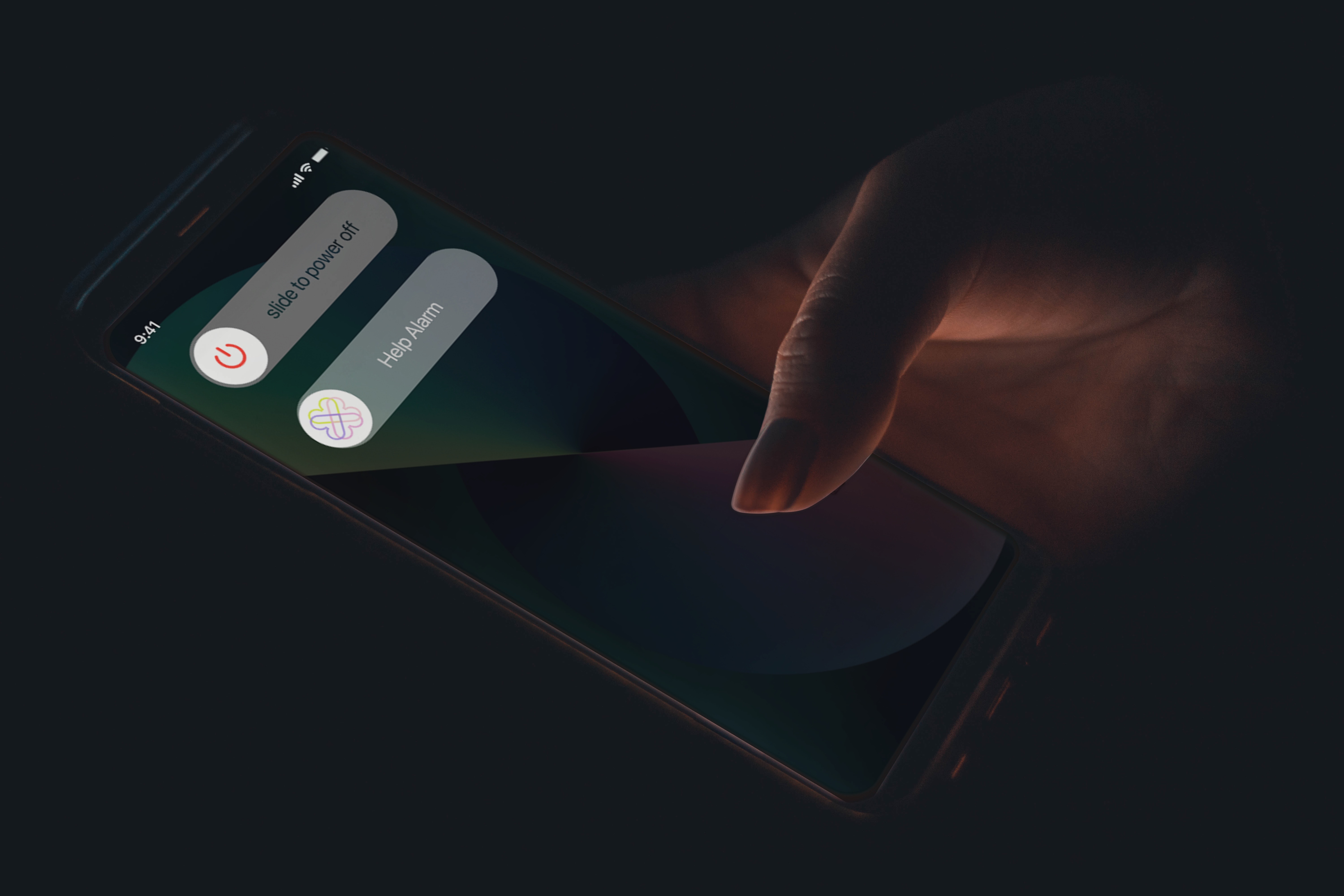
An application to alert bystanders that a user needs help via an SOS integrated within the operating system of the user’s device with increasing severity of services contacted as further SOS alerts are made or alert are unanswered.
This solution arises from the notion that most people are willing to help but require clear indication that help is needed before becoming involved. The application realises the sense of community many members of the group felt when bystanders would help them in difficult situations. The alarm also provides assistance for instances of lower severity where many members of group expressed they did not know who to contact. It felt inappropriate to contact emergency services but they still required help.
This solution is applicable to the initial problem but also transferable to other instances where women in uncomfortable to unsafe situations can not easily vocalise their need for help to bystanders: domestic violence, trafficking, sexual harassment.
The initial proposal was for an mobile applications with safety resources, where the “help alarm” could be activated within the service. The application focused on assisting users in situations at an increasing level of escalation.

Problem: The initial proposal limited use of the service to within the confines of app. This limited the availability of the service and potential bystanders who could help to those with app already downloaded, which is major limiting a factor to it’s effectiveness.
Solution: Integration within a device’s operating systems would ensure the service is consistently available to more users and increase the potential bystanders who could help.
Problem: The initial proposal included a large range of additional safety resources to the help alarm. These services are helpful but significantly increased the scope of project and complexity of interaction required within the app.
Solution: It felt unnecessary to dedicated significant time on these feature as they were auxiliary to the main feature the “help alarm” which required more focus. Subsequently the services were reduced to the minimal necessary.


The visual components of the prototype including the colour palette and logo were derived from the initial competition designs. The team wanted to use bright colours connotative of notions of friendship and sisterhood the original idea was derived from. The logo is also composed of love heart intertwined to further express this notion and hopefully share these feelings with users.
The font used - SF Pro Text - is the default font used within the IOS and was adopted for it’s neutrality and the trust associated with Apple and subsequently the font.