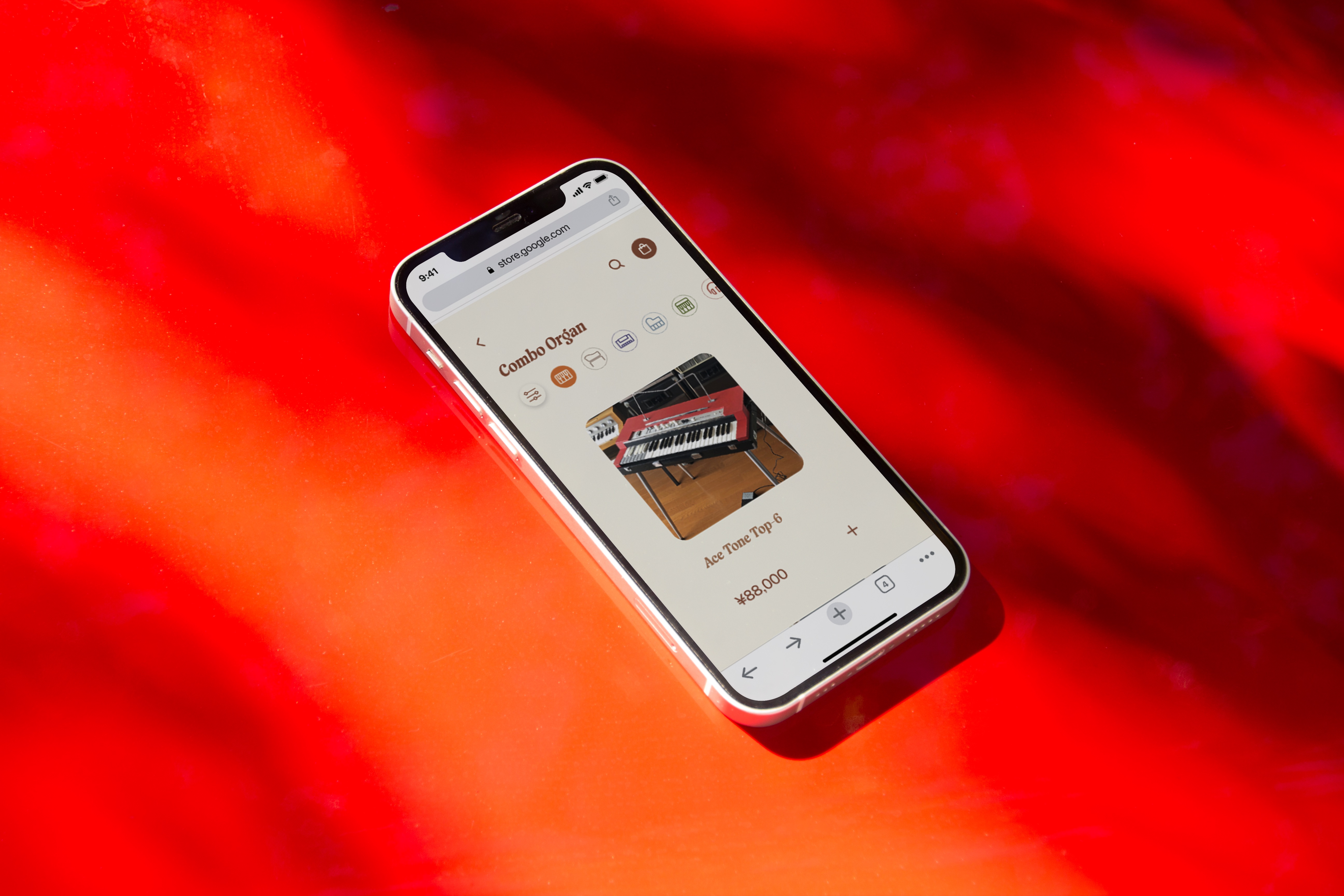
Website Redesign
redesigning a music e-commerce website for mobile and web


This project involved the redesign of an e-commerce site for musical instruments informed by analysis of the original design. For the redesign, I focused on integrating the original design’s thematic concerns and unique brand ethos with a more modern minimalist standards of design. This served to improve usability and visual balance while remaining sincere to the brand’s identity and recognisable to current customers.
The e-commerce business related to the original design is exclusively online store focused on selling second hand retro audio equipment to share knowledge of the “wonderful electric instruments exist in the world”. This passion is something I admired and wished to preserve and express in the redesign.I conducted a critical visual analysis of the original design focusing on: the homepage page, the list of products, a selected product page, and the shopping cart or checkout process. The analysis revealed several critical issues and features.


The wireframes use a consistent visual system of iconographic navigation, rounded edges and text styling to create visual unity and balance.
The homepage wireframes develop a keyboard style navigation - a thematic signifier consistent with company ethos - to include icons rather than photos; icons are more uniform and adhere better to minimalist modern design styles.
I experimented with several visual styles during ideation based on the final wireframes.
The design below examines the effect of a different navigation method on visual composition, leveraging external inconsistency to construct a more memorable interface


The retro designs combined external standards of retro style and unique features of the original design to comply with specific discourses of retro design: Art Nouveau, American Kitsch and Bauhaus.
The designs, specifically integrated components from the original design - keyboard navigation with product-specific colours - to retain brand ethos and remain recognisable with key brand components.
I also explored design styles that deviated from the original design to facilitate the exploration of a wider range of design styles outside the initial design scope: maintaining the original design style. Different design styles are explored through the format of content and typeface.


This stage of the project focused on the technical implementation of the design from an interactive prototype to functional page using HTML, CSS and Javascript. The implementation of the design assessed it’s technical feasibility and required critical consideration of alternative design solutions.
The cart model assumed a background overlay to focus the user gaze on the cart content by leveraging Gestalt, as the additional content otherwise proved distracting to users during brief user feedback.


The search Input was removed from navigation bar in the web interface and only displayed on relevant search page to reduce content redundancy


Request and Inquire buttons were not have fixed as users indicated the buttons were too clicked accidentally too easily frustrating users. The product type icon is not highlighted as the highlight inferred the icon was active inferring a completed interaction causing users to miss the icon’s functionality and become frustrated.

%201.png)

%201.png)
System error messages were used instead of custom error messages as they were more familiar and readable due to the contrast.
The project can be considered a success by measures of the initial project goals.